Business Website · NusaClean
NusaClean
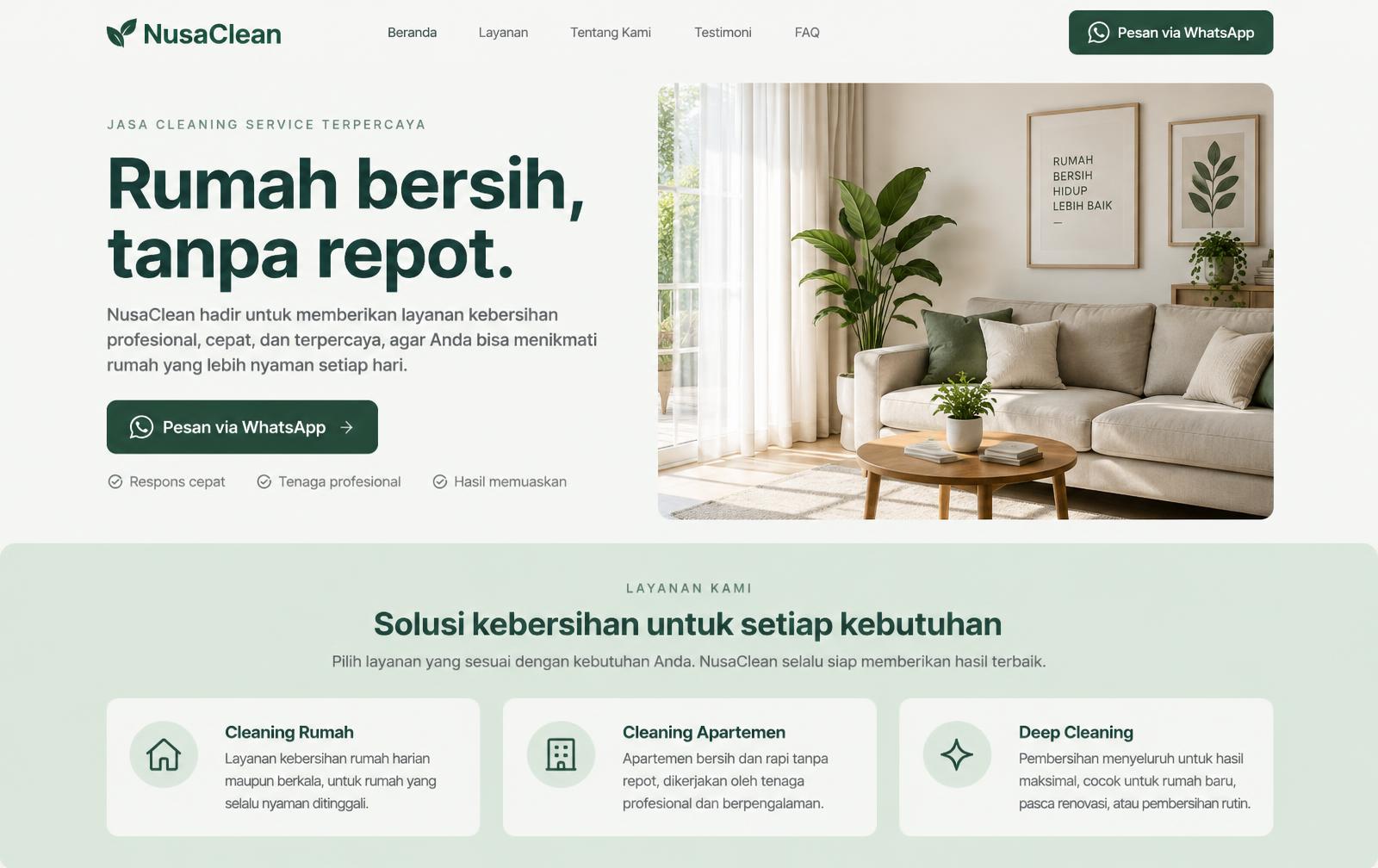
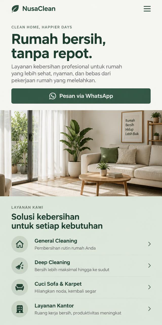
A cleaning service website concept that organizes service and coverage information so prospective customers can understand their options before enquiring.
Project overview
This concept project explores how a cleaning-service business can present its services clearly, explain the booking process, and make it effortless for potential customers to start a conversation.
Design highlights
Project Goals & Scope
Crafting a residential cleaning landing page that builds trust through transparent service packages, an intuitive booking flow, and clear satisfaction guarantees.
Structure & Hierarchy Decisions
Service categories are presented upfront so visitors immediately understand offerings without hunting for details.
Desktop & Mobile Implementation
Responsive layout tuned for natural tap zones on mobile devices (375px–430px) as well as practical desktop views.
CTA Flow & Next Actions
WhatsApp buttons strategically placed at decision points to facilitate immediate booking inquiries.
Color palette
Forest green #285C45
Primary tone for buttons and headings — conveys freshness and trust.
Off-white #F7F8F5
Bright, calm background ensuring effortless readability.
Sage #DDEBDD
Soft section divider providing subtle depth without visual clutter.
Deep green text #242B27
Dark green-tinted charcoal with comfortable reading contrast.
Page structure
- 01Header and primary navigation
- 02Hero section with direct enquiry CTA
- 03Clear service differentiation grid
- 04Step-by-step workflow (How it works)
- 05Service package options (Illustrative)
- 06Trust factors & key guarantees
- 07Frequently asked questions
- 08Final conversion CTA & inquiry form
- 09Footer navigation and legal notes
Testing & QA
- Responsive layoutsTested across mobile (375px–430px), tablet, and desktop screens.
- Touch-friendly navigationTap targets sized appropriately for mobile thumb zones.
- WhatsApp enquiry flowPre-filled structured parameters verified.
- Text contrast & readabilityMeets WCAG AA standards with clear typographic hierarchy.
- Image optimizationResponsive WebP delivery with descriptive alt text.
- SEO & metadataSemantic heading structure and reciprocal hreflang annotations.
Outcome
The result is a clean, conversion-focused landing page that communicates services clearly, builds trust through structure, and funnels visitors into a single WhatsApp enquiry flow.
Start Your Project
Planning a website for your business?
Tell me about your business goals — I'll review your ideas or current site and suggest the clearest path forward.